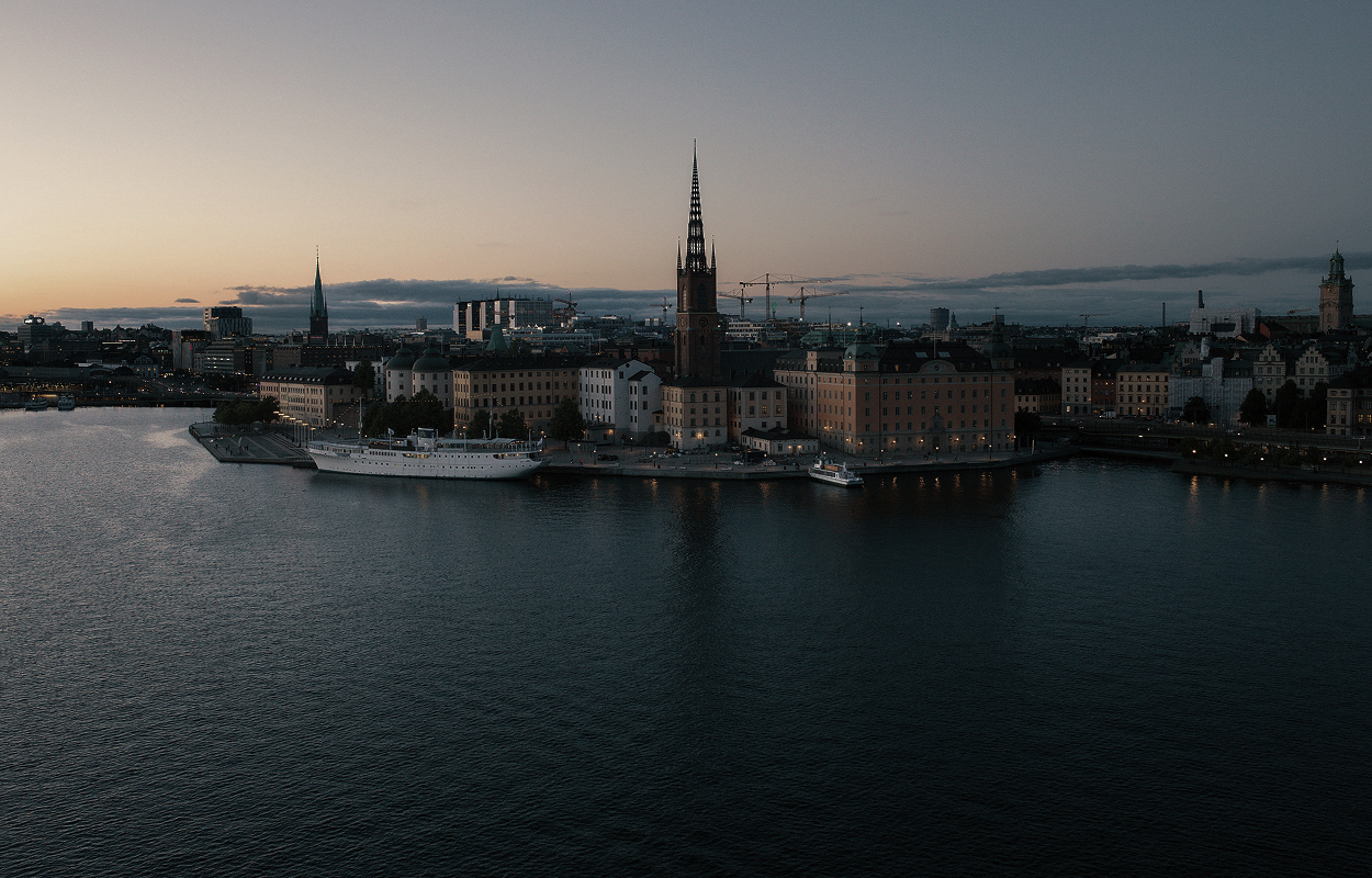
Akademisk Kvart · Case study by Alfons Melander

A subletting platform for students seeking housing in Stockholm.
- Role
- UX Engineer
- Timeline
- Feb 2026 – Jun 2026
- Team
- 5 people
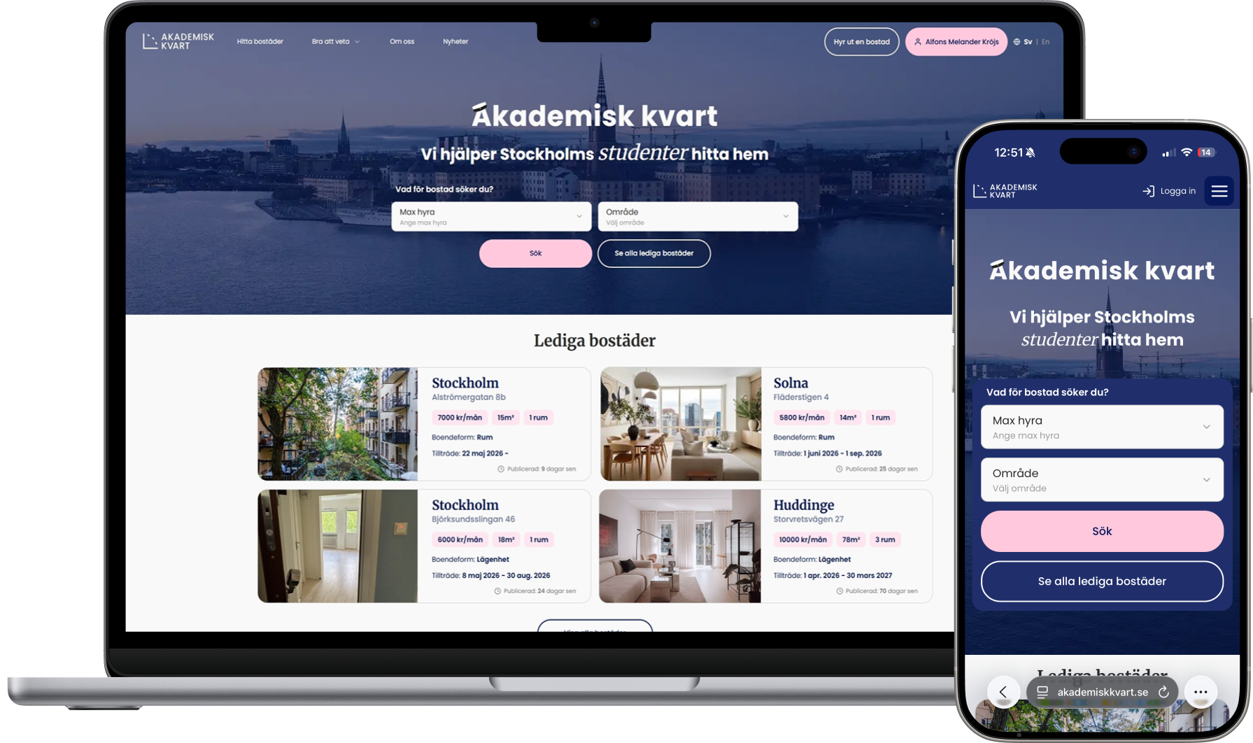
Hero on mobile
Data-driven redesign
User surveyNext.jsFigmaWhile working on the site, I noticed I often skipped past the hero when testing, but it was always something needing to be fixed. Since the hero is the first thing users see, I wanted to improve it. On mobile, the buttons felt too small, and the large number of filters made the experience feel cluttered.
I realized the problem was not only the number of filters, but also a mismatch between user needs and the available listings. The filters suggested more options than actually existed, which often led to zero search results and a frustrating dead end. To validate what mattered most, I surveyed 23 students and found that max rent and area were the top priorities. Based on that, I redesigned the hero and implemented it in Next.js.
What are the most important metrics when searching for housing?
Max rent
21
Area
14
Size
9
Contract
7
Rooms
6
Move-in date
4
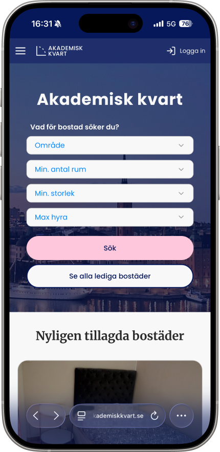
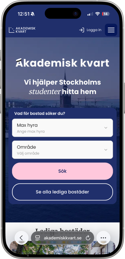
- Reduced 4 filters to 2 key filters
- Increased button size for clearer mobile tap targets
- Improved padding to make the hero feel less cramped
4 filters→2 key filters
Small buttons→larger tap targets
Tight layout→clearer spacing
Second improvement
Easier forms
FigmaPrototypingAfter improving the mobile hero, I worked on the ad creation flow. The platform depends on landlords creating listings, so the form needed to feel clear, predictable and quicker to complete.
1. Flow design
Introducing a wizard
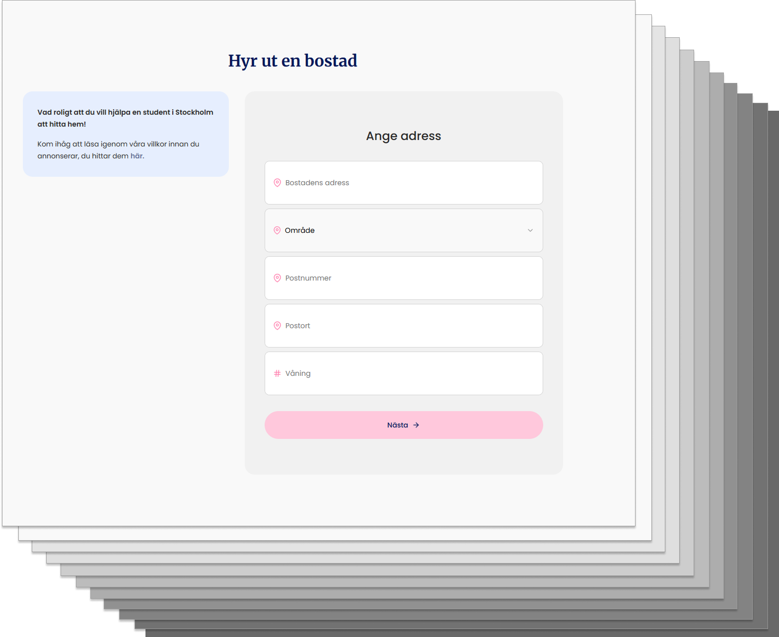
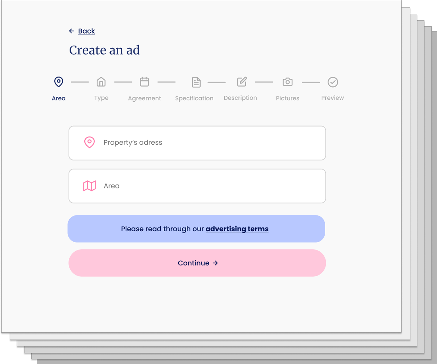
The first issue was how the user had no idea how long the process is. A common solution is to introduce a wizard. Users handle complexity better in chunks than all at once. A wizard also gives the ability for the user to go back to each stage, which helps error prevention.

2. Validation
Dot-voting & Structured design critique
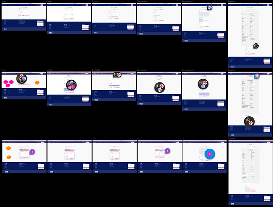
I made three different designs solving the perceived problem. I then asked the team what version they thought solved the problem. I introduced dot-voting, which gives every team member 3 votes each to place on the preferred version. Then they critiqued the design they liked most, and I used that to shape the final design.
3. Simplification
Going from 12 to 7 steps
Reducing the number of steps in the process removes friction. Introducing a wizard does not work well with 12 steps because it interferes with the flow and becomes fragmented. Reducing the flow down to 7 steps creates a clearer and faster experience for the user.
Third improvement
Landing page restructure
Next.jsFigma1. Implementation
News section
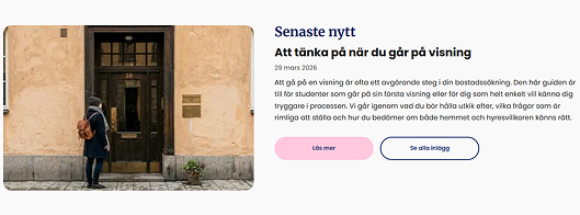
I implemented a Next.js server-side component connected to AWS for the landing page. The section itself was designed by Isabelle Franzen, and I integrated it into the site.
2. Value proposition
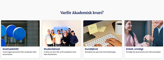
Why Akademisk Kvart?
This section clarifies the platform's value proposition for students and explains why someone should choose Akademisk Kvart. It highlights that the service is free, easy to use, and run by students.
I also built this as a Next.js component and integrated it into the landing page.
3. Navigation
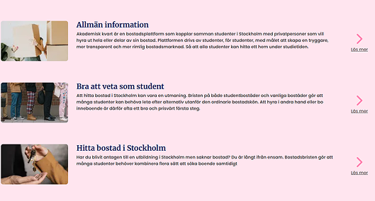
General information
This section helps visitors find key pages more easily. I designed it as a quick-link area that guides users to important pages across the website.
4. Polish
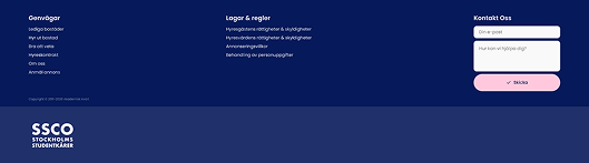
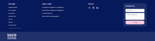
Improved footer
I made small design and implementation updates to the footer. The previous version had cramped links and no social media links, which made the area feel unfinished.
I increased the padding, added social links, and improved the small contact form to make the footer clearer and more useful.
View the live website
Akademisk Kvart is live and continues to support students looking for housing in Stockholm.